I Gave My Brand Logo to Three AIs — Gemini Drew, Codex Vectored, Claude Deployed
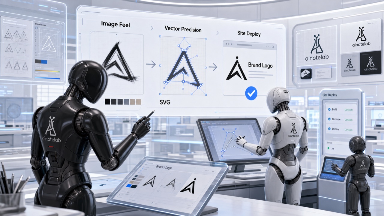
This site needed a logo and a mascot. So I handed it to AI. More precisely: I tried to give the whole job to one AI, failed, and ended up splitting it across three. Gemini drew the images, Codex carved the vector, Claude put it on the site. Along the way I learned, the hard way, that each AI is good at a completely different layer.
1. Gemini — great at "the look," bad at "precise control"
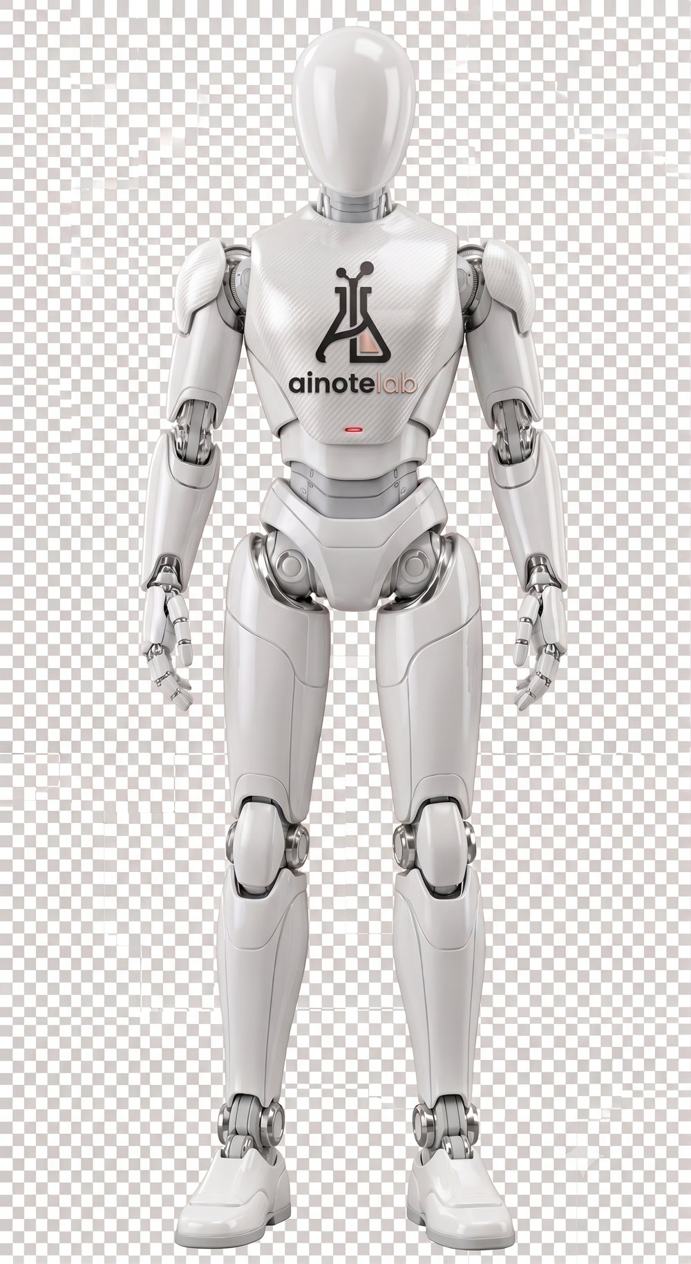
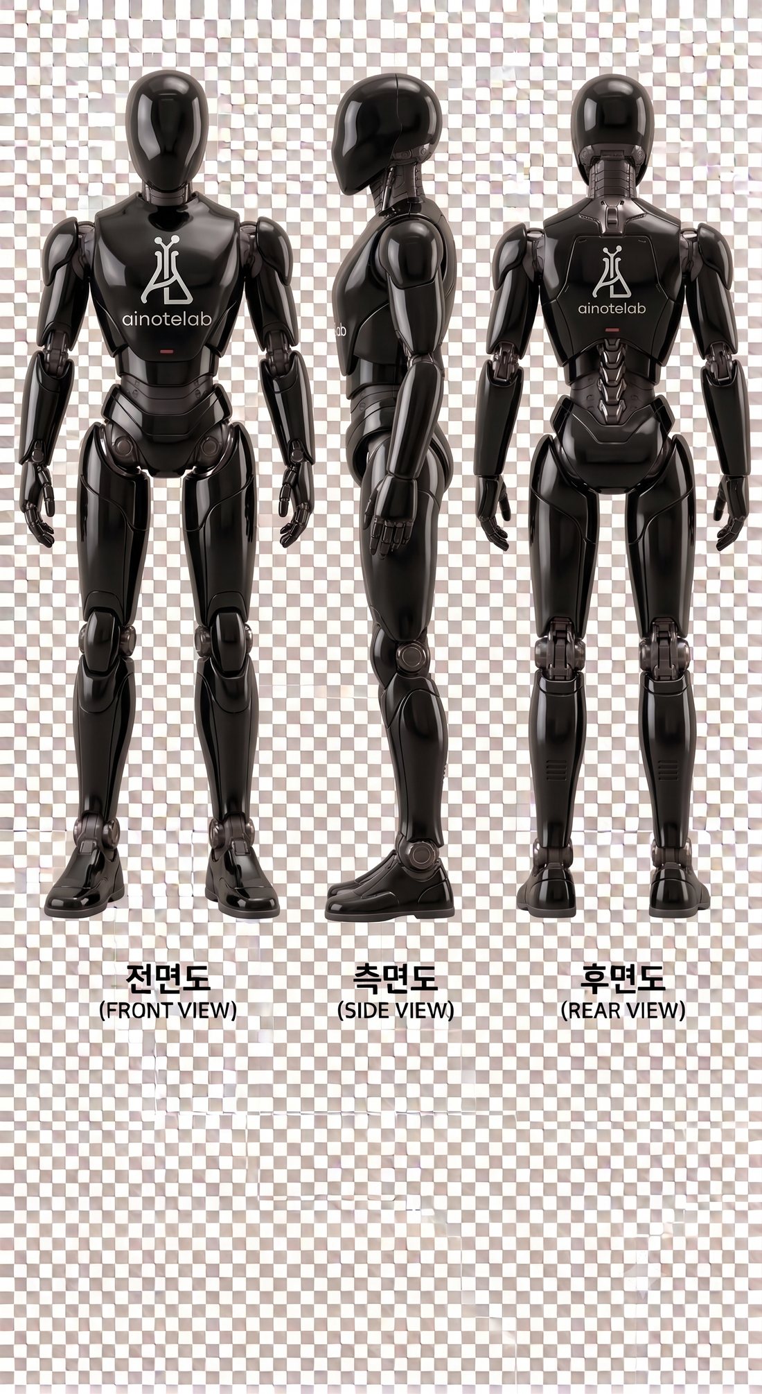
It started with the mascot. I told Gemini "like a single black glossy material, a cooler robot, no background," and it produced a genuinely nice robot — front, side, and back views, with our flask symbol and "ainotelab" on the chest. Image generation, it clearly does well.
But every time I needed precise control, it hit a wall.
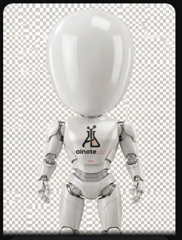
It couldn't change the proportions. What I wanted was a flat, cartoon-style cute chibi — big head, chubby body, short legs. Asked for "a big-head doll proportion, short arms and legs," it enlarged the head but left the limbs alone. Gemini admitted it plainly:
"I was unable to shorten the legs and hands as you requested. The limbs retain their original length, so it reads as a bobblehead rather than true SD proportions."
And sometimes it just broke. After generating images for a while, something would tangle and Gemini would start spitting out, of all things, textbook diagrams like "Types of Rocks" and "Photosynthesis" instead of the robot — and then couldn't generate images at all. It said so itself:
"Here the image tool is behaving as if it's been contaminated, so it can't produce a result."
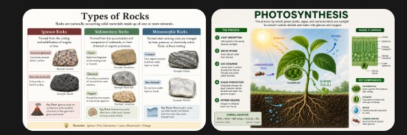
The fix was almost silly: open a new session and hand over the original again, and it drew fine. Once a session fell into that state, there was no recovering inside it — you had to start over entirely.
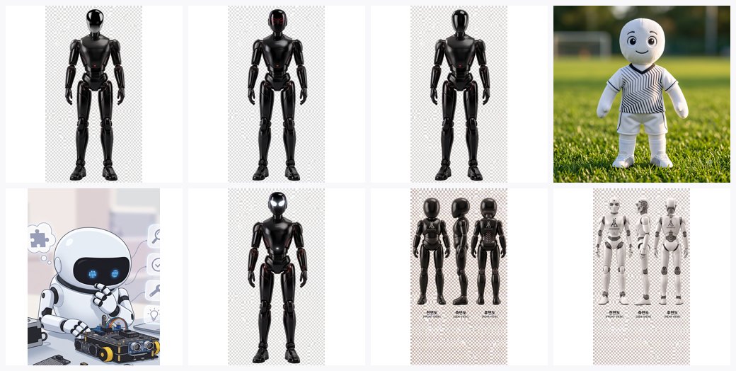
It couldn't vectorize either. I wanted to lift that chest symbol out and use it as a logo. For that it has to be a vector (SVG), not pixels — so it stays sharp when scaled and crisp in a web header. When I asked "remove the white background and make it a vector," Gemini was honest again:
"Due to the limits of a text-based AI model, I cannot directly convert this into a perfect vector file with the white background removed."
It only explained methods (Illustrator Image Trace, Inkscape, Vectorizer.ai), warning that auto-tracing would split the gradient into banded solid strips and roughen the letter edges, so you'd have to redraw it inside a vector program anyway.
Here's the first finding. Image-generation AI is excellent at "this vibe," but weak at "3px at this angle, at this ratio, as a vector." Making a picture and precisely controlling shapes are different abilities.
2. Codex — carving the vector by hand (68 exchanges)
So I approached the vector through code. I gave OpenAI Codex the original image and started with "make it an SVG, without the text." This is where it got real. Finishing one logo took 68 back-and-forths — and the conversation ran so long that the context got compacted midway, and a good chunk of the record was lost.
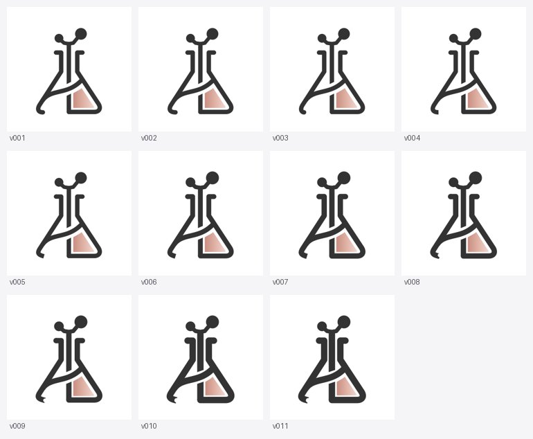
The instructions grew precise. A few, transcribed:
- "The horizontal line and the center vertical line must be apart; the right end of the horizontal must touch the right side."
- "Where the vertical meets the horizontal, don't round it — cut it on a diagonal, straight."
- "Thicken the black strokes 20%, keep all lines apart; not by enlarging, but growing inward."
- "The colored shape sits inside the black lines with a consistent gap, filled to follow the curve."
This wasn't a conversation so much as steering a designer's hand by remote — translating one coordinate, one angle, into words.
And there was friction
The AI kept touching things I hadn't asked about.
"Why do you keep changing parts I never mentioned?"
Worse was the preview. I'd ask for a fix and the screen showed the old picture. I thought the AI had wrecked it and redid the request several times — only to realize it kept showing me the very first drawing as the preview. The output wasn't broken; the communication was.
"You had me clicking the first drawing as if it were the preview, so I thought you'd done it wrong."
And out of the chaos, discipline emerged
In that mess, I set my own working rules.
"Save this under a different name. The saved copy must not be corrupted. From now on, save as 'final' only when I say so; otherwise create a version like v012."
Because the AI kept making irreversible messes, I had no choice but to build version control and original-protection — the same reason developers use Git for code. To create with an AI, you first need a point you can roll back to.
Dozens of versions later, the logo was done. The vector precision the generative AI said it "couldn't" do, Codex saw through to the end — as long as the instructions were exact.
3. Claude — putting the finished piece on a real site
Having a logo file isn't the end. Getting it live on a real website is another layer, and this is where the third AI came in. Two practical traps were especially valuable.
The 16px favicon wall. I made the symbol into a browser-tab icon; fine at 32px, but mush at 16px. The thin strokes and the molecule detail on top were simply too much information at that size. A pretty logo isn't automatically a good favicon.
An SVG OG image shows no preview. The social-share OG image was an SVG — but Facebook, KakaoTalk and Slack don't render SVG OG images. Share a link and the preview card had no picture. Only after switching to a 1200×630 PNG did it show. Vector isn't always the answer — each spot wants its own format.
4. In the end, color was taste
The last thing left was color. I went rose gold, then tried red. Pure red was too harsh, so I asked to "dial the intensity down a bit," and out came soft-red. This wasn't something data could settle. I just liked that color. The logo at the top of this site is that color.
What I took away
- Don't give the whole thing to one AI. Image generation, vector precision, and web deployment are different abilities. Give each AI the job it's good at.
- Generation is "the look," code is "control." Precisely shrinking a proportion or making a clean vector is hard for a generative AI. When you need precision, go through code.
- For precise work, the instruction is everything. Codex was exactly as accurate as the coordinates and angles I gave it. Vague in, vague out.
- Generative AI has a consistency limit. Regenerate the same mascot and the face differs every time. You need a fixed element — like a logo — for it to read as the same character.
- To create with AI, first build a point to roll back to. Without version-saving and original protection, one bad edit loses everything.
- Finished and in-use are different problems. Like the 16px favicon and the OG format, there's another wall between making a thing and getting it actually used.
- Taste can't be decided by data. The final color, I picked because I liked it. Some things an AI can't decide for you.